You spend months selecting the perfect Italian marble. You invest in custom teak joinery. You buy a velvet sofa that costs as much as a small car. However, the moment you flip the switch, your room looks flat, sterile, and cheap.
Why does this happen? Usually, the culprit hangs right above your head. You likely chose the wrong light bulb.
Lighting acts as the invisible makeup of your home. It can either elevate a room to a 5-star hotel standard or degrade it to a hospital waiting room. In reality, mastering luxury design requires mastering the physics of light. You must understand more than just “wattage.” You must understand color temperature and fidelity.
Therefore, we created this guide to decode the spectrum. We will explain why “Cool Daylight” kills luxury, why gold needs warmth, and why CRI matters more than you think.
Ready to see your home in a new light? Let’s flip the switch.
Choosing the Right Color Temperature for Luxury Interiors
1. Decoding Kelvin: It’s Not Just a Color, It’s a Spectrum

First, let’s get technical. We do not measure light color with vague terms like “soft” or “bright.” Instead, we measure it in Kelvin (K).
This unit measures the photometric performance of the light source relative to a heating black-body radiator. Simply put, as you heat an object, it glows red, then yellow, then white, and finally blue.
Consequently, you need to know three distinct zones:
-
Warm White (2700K – 3000K): This mimics the sunset or candlelight. It feels cozy, intimate, and relaxing.
-
Natural White (4000K): This mimics mid-morning sunlight. It looks crisp, neutral, and clean.
-
Cool Daylight (6000K+): This mimics the harsh, blueish light of high noon. While efficient for factories, it creates a sterile atmosphere in a home.
2. The Psychology of Luxury: Why Warmth Wins
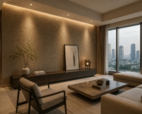
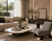
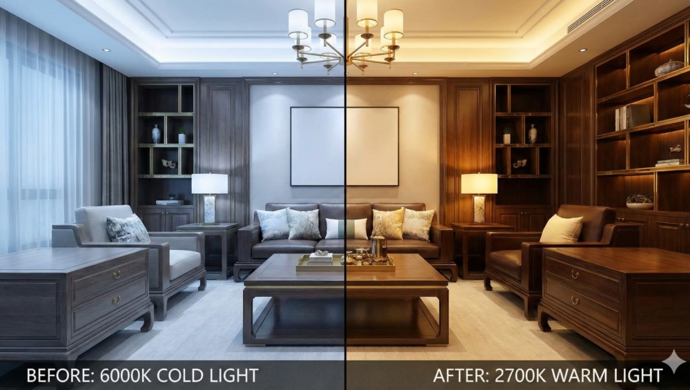
Walk into any Ritz-Carlton or high-end boutique. Inevitably, you will notice a common theme: the lights glow with warmth (usually 2700K to 3000K).
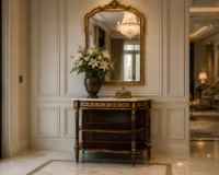
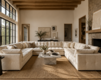
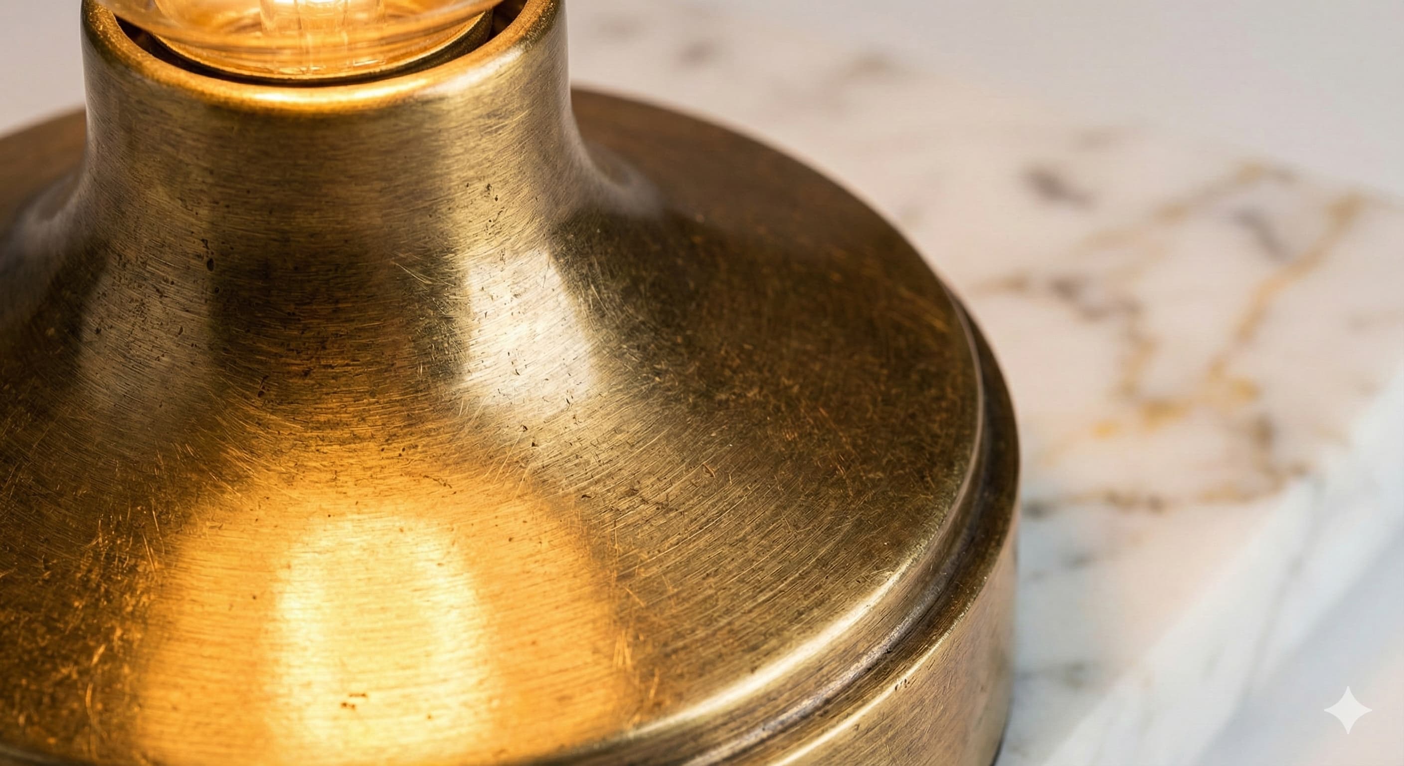
Why do designers insist on this? It comes down to material interaction. Luxury interiors often feature rich textures like gold accents, teak wood, and veined marble.
-
Warm Light: A 3000K bulb enhances the reds, oranges, and yellows in wood and gold. Thus, the wood looks richer, and the gold sparkles. It creates that signature warm glow.
-
Cool Light: A 6000K bulb blasts blue wavelengths. When blue light hits gold, the metal looks greenish and dull. Furthermore, it flattens the depth of fabrics, making your expensive velvet sofa look like cheap polyester.
Ultimately, using Cool Daylight in a living room destroys the ambiance. It signals “alertness” and “clinical hygiene,” which kills the vibe of relaxation.
3. The Secret Spec: Why CRI Matters More Than Brightness
Now, let’s separate the amateurs from the experts. You might buy a 3000K bulb, but your furniture still looks muddy or dull. Why?
You likely ignored the CRI (Color Rendering Index).
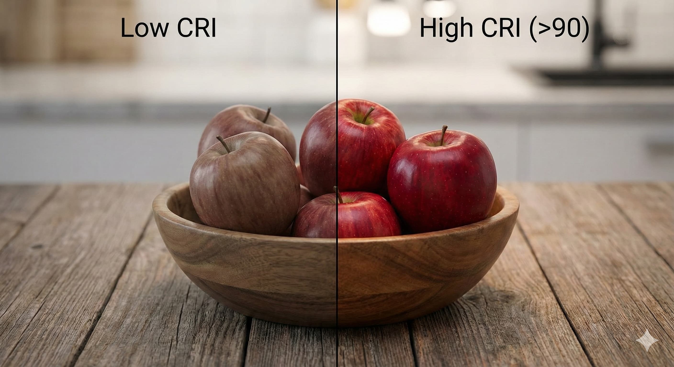
CRI measures a light source’s ability to reveal the true colors of an object compared to natural sunlight (which has a CRI of 100).
-
Low CRI (<80): Most cheap LEDs fall here. They miss parts of the red spectrum. As a result, skin tones look grey, and wood looks lifeless.
-
High CRI (>90): High-end LEDs hit this benchmark. They render colors faithfully.
Therefore, always check the box. If you invest in expensive art or furniture, you must buy High-CRI bulbs. Otherwise, you are viewing your investments through a dirty lens.
4. Room-by-Room: The Ideal Temperature Guide
So, should you put warm bulbs everywhere? Not necessarily. You must align the lighting with the room’s function and your circadian rhythm.
-
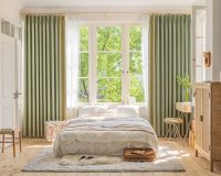
The Living Room (2700K – 3000K): This space serves relaxation. Therefore, stick to warm white. It helps your brain produce melatonin, signaling that the day is ending.
-
The Kitchen (3000K – 4000K): Here, you need to see what you chop. However, avoid going too cool. A 3500K or 4000K bulb provides enough contrast for safety without turning your kitchen into a laboratory.
-
The Bathroom (Layered Approach): Ideally, mix your sources. Use 4000K vanity lights to see your face clearly for makeup or shaving. Then, add a hidden 2700K strip light for a relaxing soak in the tub.
Conclusion: Respect the Spectrum
Lighting is not an afterthought; it is the foundation of design. By choosing the correct Kelvin temperature and prioritizing High-CRI bulbs, you respect the materials you paid for.
Next time a contractor tries to install “Cool Daylight” panels in your living room, stop them. Choose warmth-luxury.